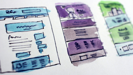
What great design looks like
An enticing website that provides information, support and inspiration is even more critical with many organisations seeing uplifts in digital engagement.
For us, a great design delivers impact to both the organisation and the customer, member or prospect. We work closely with our clients in user-focused discovery and design workshops to understand their ambitions before putting them to action.
In this blog post, we want to share some of our experience and inspire you with a showcase of great designs that our teams have put together over the years.
Twins Trust
The impact of the new Twins Trust website is demonstrated with the two Best Website award nominations in 2020, at the memcom Excellence Awards and the AAE International and European Awards.
This innovative and user-centred website design enables families with twins and more to find support at every stage of the way from pregnancy to their children’s teenage years.
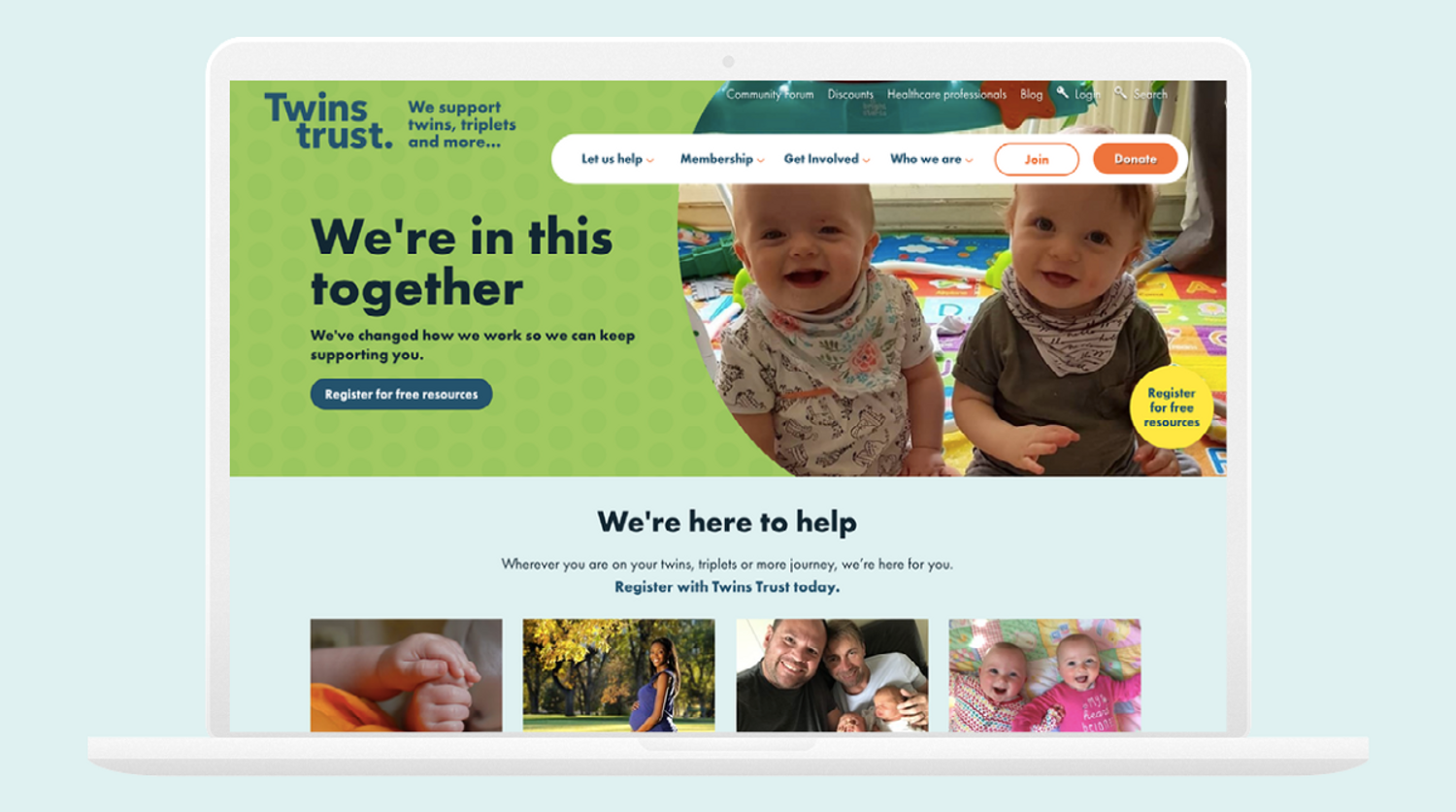
As well as providing guidance to parents for their child’s development, there is a dedicated part of the website to support bereaved parents. The balancing of these two audiences and mailing lists resulted in a focus on tone and colour to show understanding and empathy.
The main site’s vibrant green palette is an example of championing unique branding to help Twins Trust stand out against their competitors. We also provided imagery guidance, adapting the original abstract photography for a more obvious and community-focused angle.
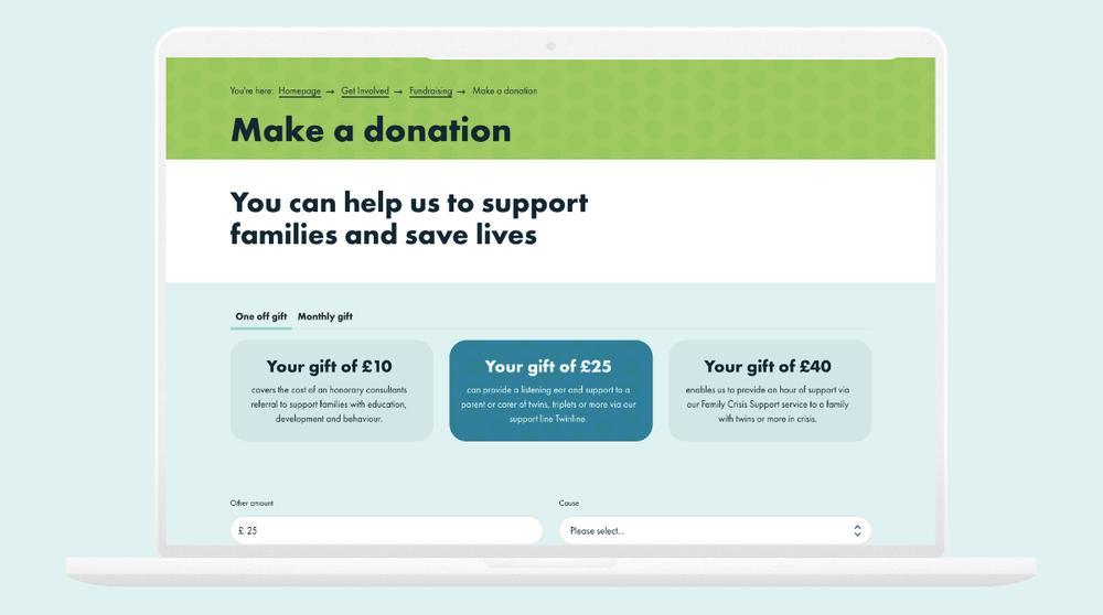
A key success with this site are the clear CTAs and the well-thought out donation journey. The users are presented with clear donation options and an easy navigational process, which is a result of style guidance from our consultants to ensure the user-journey is simple, whilst caring.
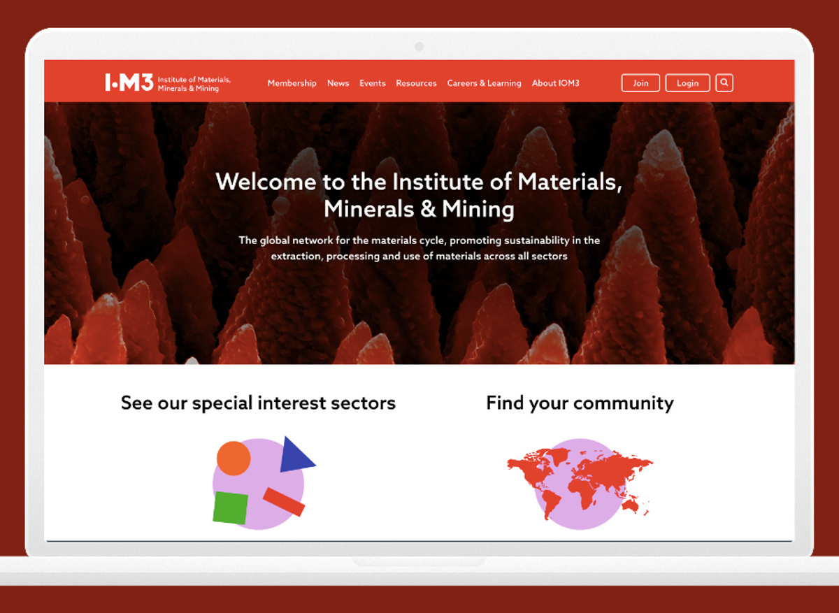
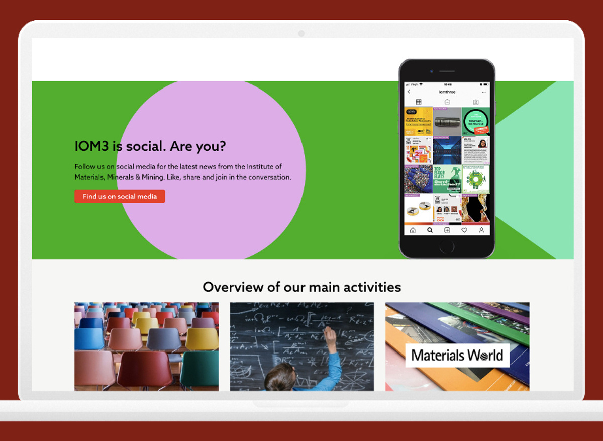
Institute of Materials, Minerals & Mining
IOM3’s platform supports professionals in technical disciplines through a modern, flexible and content-driven website. We were provided with style guidelines that IOM3 had made to translate their vision for a rebrand.
The key aspect of this design was taking the rebrand elements from print and pulling this through into their digital platform, such as the blocks and shapes which make up their logo. IOM3 wanted flexibility and versatility, resulting in bespoke and custom widgets which allow text, such as testimonials, to be broken up with imagery and pattern work.
IOM3 1
IOM3 2
And there's more
See more of our recent examples to understand how we deliver designs that attract, nurture and convert to members and beyond from TechUK, BDA, FMB and IWFM.
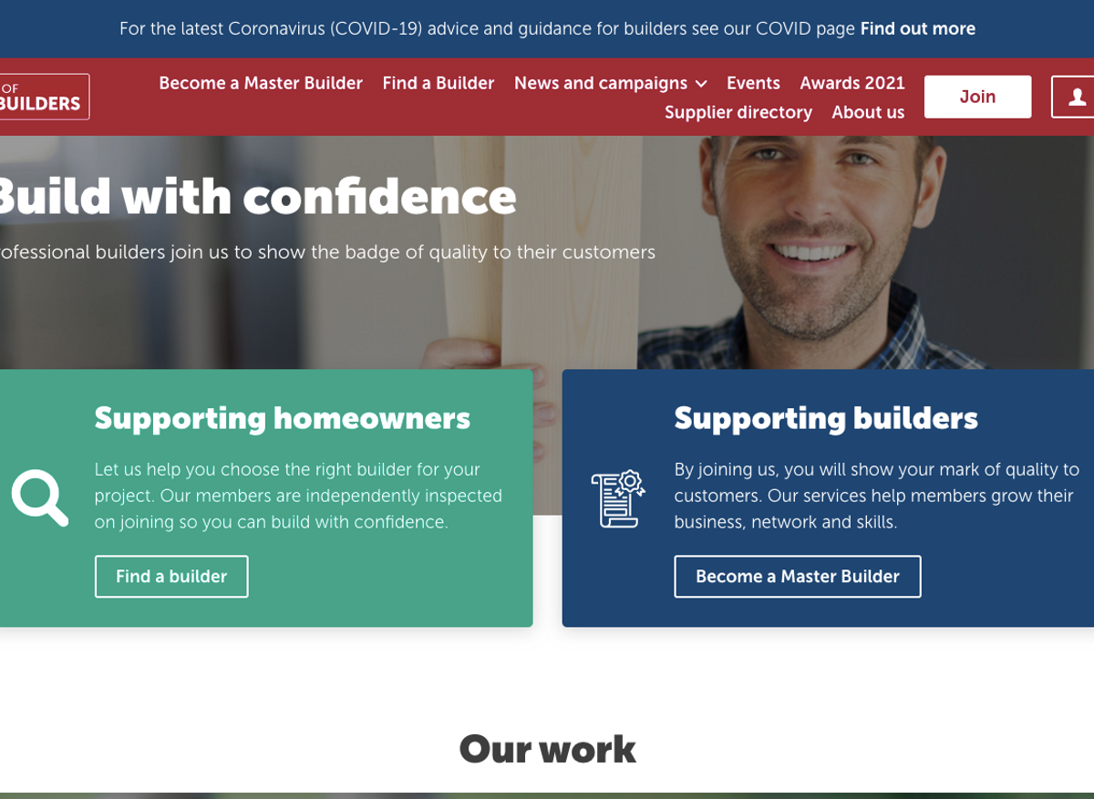
The Federation of Master Builders - FMB
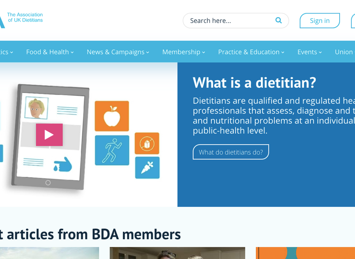
British Dietetic Association - BDA
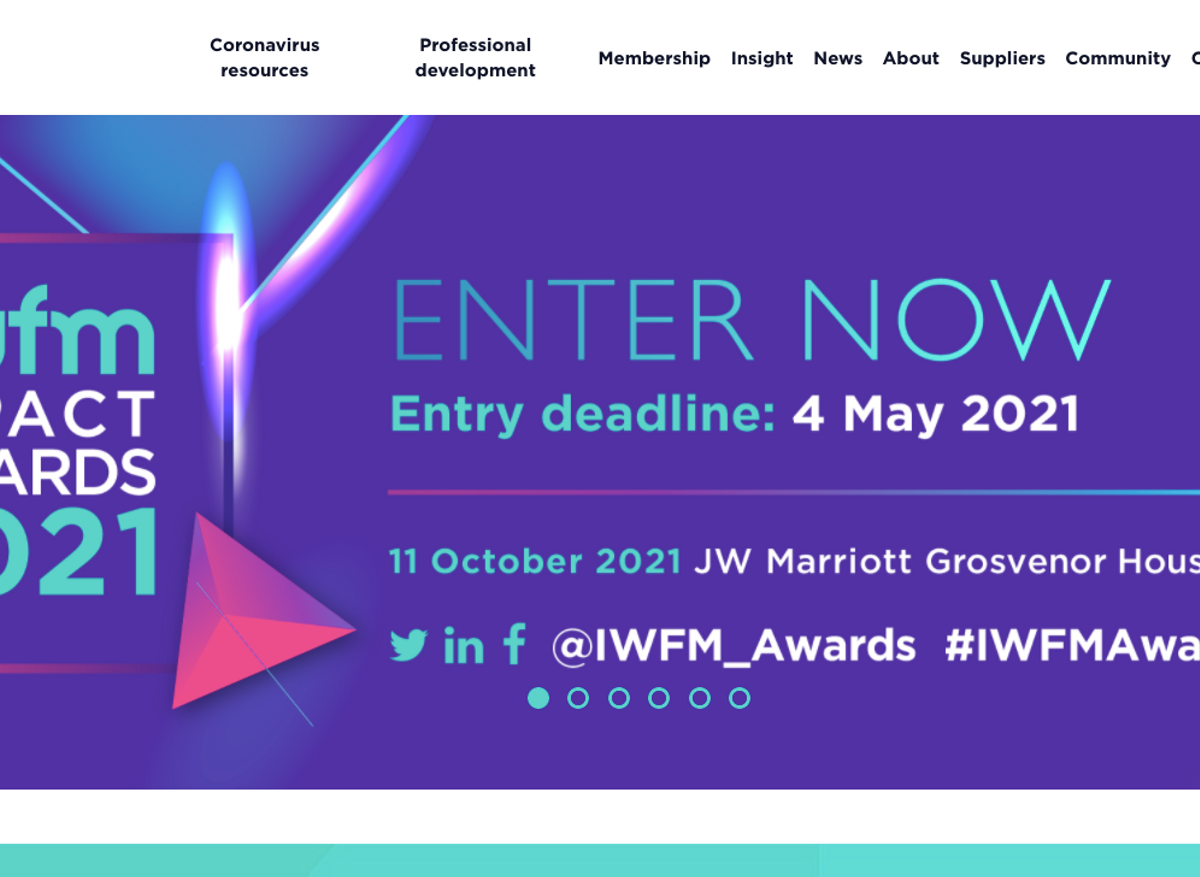
IWFM Homepage
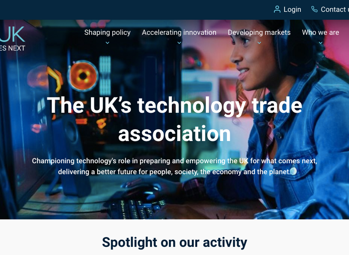
The UK's Technology Trade Association