How to bring your brand to life online with design systems
“Your website is your digital shop window”. It’s an analogy that you’ve probably heard before, but it’s incredibly fitting when it comes to design considerations. Your homepage needs to impress - and so should every other page a user visits on their journey.
Design systems help to enable a coherent look and feel across all of your digital channels. At Pixl8, they underpin our approach to website design, ensuring strong foundations for development. They form the basis of your digital style guide, providing rationale, documentation and best practices for your staff to follow.
In this blog, I’ll explain how a design system can help teams across membership organisations bring their brand to life in a clear, creative and consistent way.
What they are and why they’re important
Design systems are not a new idea. The 1970 New York City Transit Authority (NYCTA) Graphics Standards Manual is a brilliant example of such a guide. Back in the 60s the NYC subway signage system was complex and confusing - not just graphically, but in the way they described things and in their placement.
Passengers didn’t know where to look or where to go - problems that are not dissimilar to those faced by website users of the modern age. The NYCTA manual finally described how every sign in the NYC subway system should look and the signage uses the same principles set out in this guide to this day.

Andy Orme, Senior Digital Designer

A digital design system helps organisations produce consistent material that’s in line with their wider brand. Brand guidelines, on the other hand, are more general and less focused on the digital implementation. It works like a Haynes manual for how a brand should be presented digitally to the wider world. A good design system should be clear and easy to follow for all members of the team, regardless of skill level.
At its most basic level a design system should provide key identifiers such as a logo, colour palette and font preference. More in-depth examples aim to convey a visual language, detailing how interfaces are built, drilling down to their core elements. This aims to keep things consistent and helps to build up familiarity with a brand amongst its audience.

Glossary
A comprehensive design guide
Your design system should act as a record of all design elements and interactions on your site. It should ensure your brand identity is applied consistently. It should make it easier to manage for the website administrator and easier to interact with for the end user. Good things to include in your design system include:
Basic UI Components
- Buttons
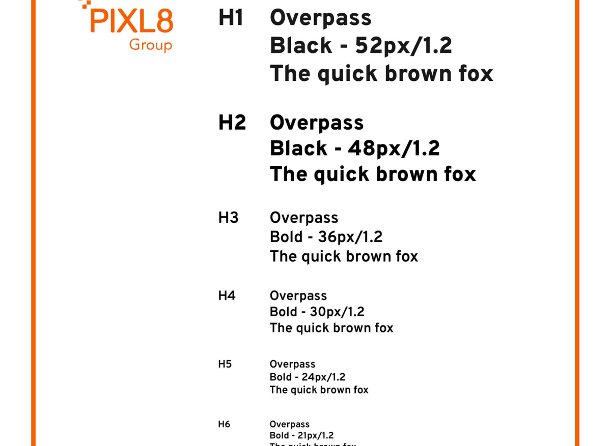
It's important to consider size and style in relation to context. Is it a primary call to action? Is it more of a secondary action like ‘Cancel’ or ‘Back’? This should dictate the visual prominence of your button. - Typography (font and font size)
Typography is a key part of your interface and helps to visualise the hierarchy of information. It should be clearly defined. Size, weight, line height and font should be specified for each different heading (H1-6), body copy and caption text. Accessibility of that text is also important (Web Content Accessiblity Guidelines) - Colour (Primary/secondary etc. )
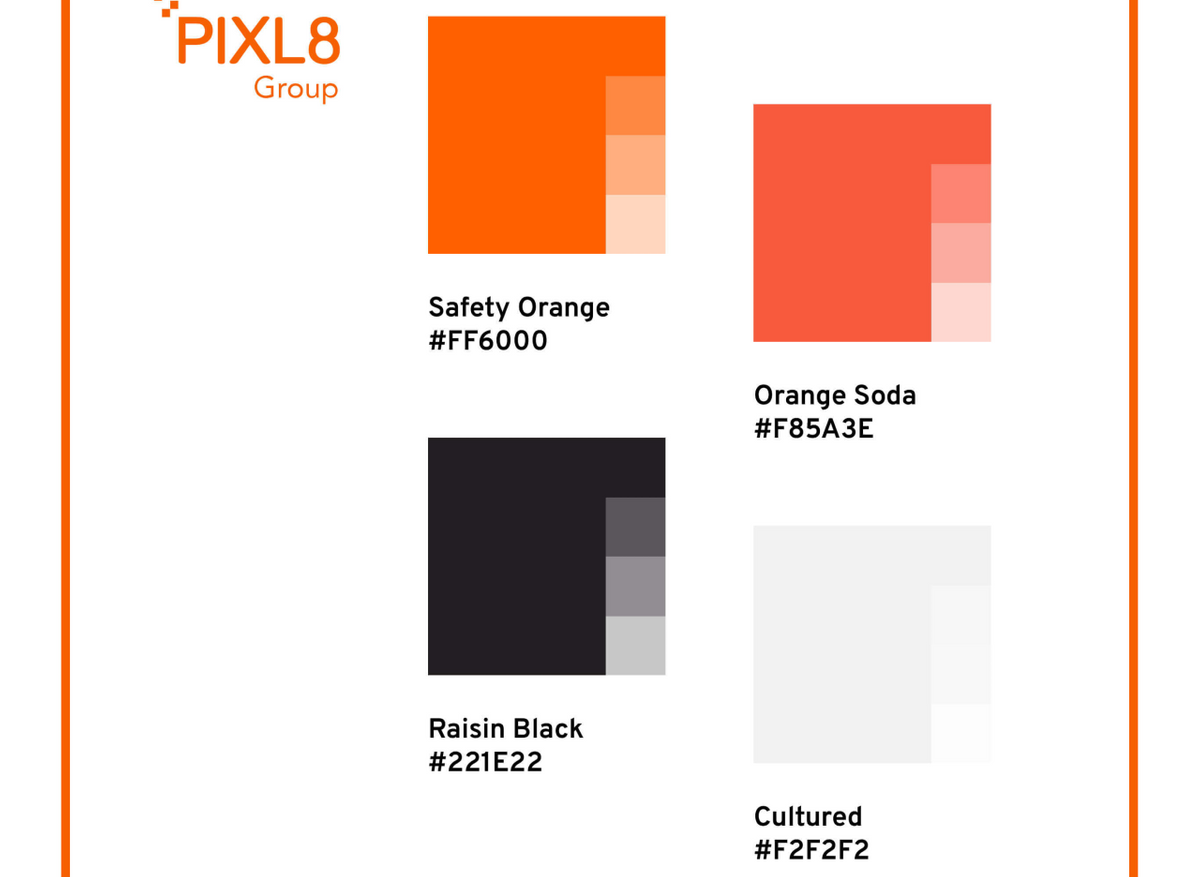
Use of colour with your brand is a very powerful tool. Listing your primary and secondary colours with their HEX values (i.e. #FF6000) is a good starting point, as well as specifying different colour combinations. It's also worth considering a good range of neutral colours that can be used for other parts of your interface.
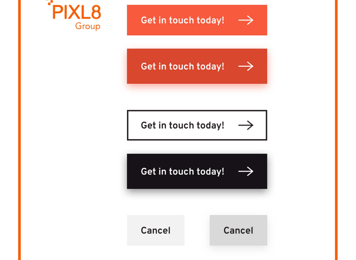
Buttons Different States and Interactive Elements
Typography Font and Font Size
Colour Primary Secondary
UX Considerations
- Different states and interactive elements
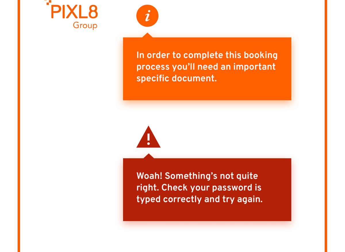
A good example of this would be a button. Buttons are multi-state elements and it's good to consider hover and active states that are noticeably different to the user from their default state. - Guidance around errors, alerts and helpful tooltips
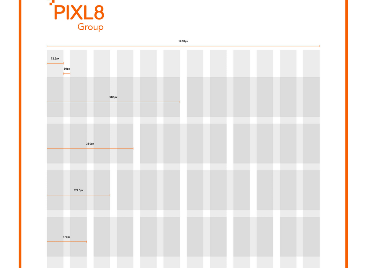
Messaging for tooltips, alerts and errors is important, as you need to convey information effectively. Style as well as language is important as it should be visible and highly noticeable. - Grid systems (usually 12 columns) and responsive breakpoints
Most sites are built on a responsive grid system of 12 columns. Defining this grid ensures that designs can adapt to different screen sizes and orientations, for a more cohesive responsive experience.
Guidance around errors alerts and helpful tooltips
Grid Systems
Documentation is key
I once read an article where someone compared the need for a digital style guide to the Johnny Cash song One Piece at a Time, where a Cadillac worker stole parts from the assembly line with the intention of building his own car. When he finally had everything needed to build the car it didn’t come together as expected. It was something of a mish-mash with key parts having changed over the years.
I’m borrowing that analogy as I think it perfectly represents the need to have all your digital design elements documented in one place. Otherwise after a little while your Cadillac of a site may end up looking a bit funny, with important parts not quite fitting together.
Shared knowledge is power
Once a design system and digital style guide is in place, teams across organisations are empowered to optimise the website design in a consistent way. Pixl8 can help you do this for your existing website - do get in touch. Plus, keep an eye out for our free guide to doing a design audit - coming soon in this design takeover month.